Giving a much-loved cinema guide some soul.
Every independent screening in London, with a brutalist point of view.

The brief
Pictures is James's, not mine. He built a guide to every repertory and independent film screening in London, all pulled into one calendar, and it already had plenty of users. What it did not have, in his words, was soul.
So he handed me the kind of brief most designers only dream of: make it brutalist, and care more about how it looks than whether it is strictly usable. I took that and ran.
At a glance
- TypeRedesign
- RoleDesign
Unapologetically brutalist
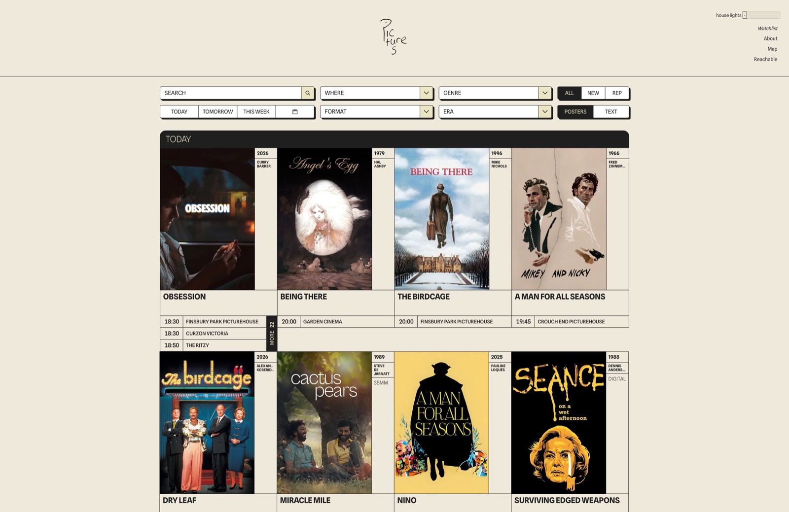
A warm near-white canvas, heavy black type set tight, and labels in flat all-caps. No shadows, no gradients, nothing soft. The film posters are the only real colour on the page, and that is the point: the design steps back and lets the programme shout.
It is dense on purpose. A listings tool earns its keep by showing a lot at once, the way a printed repertory calendar does, so the layout leans into the information rather than hiding from it.
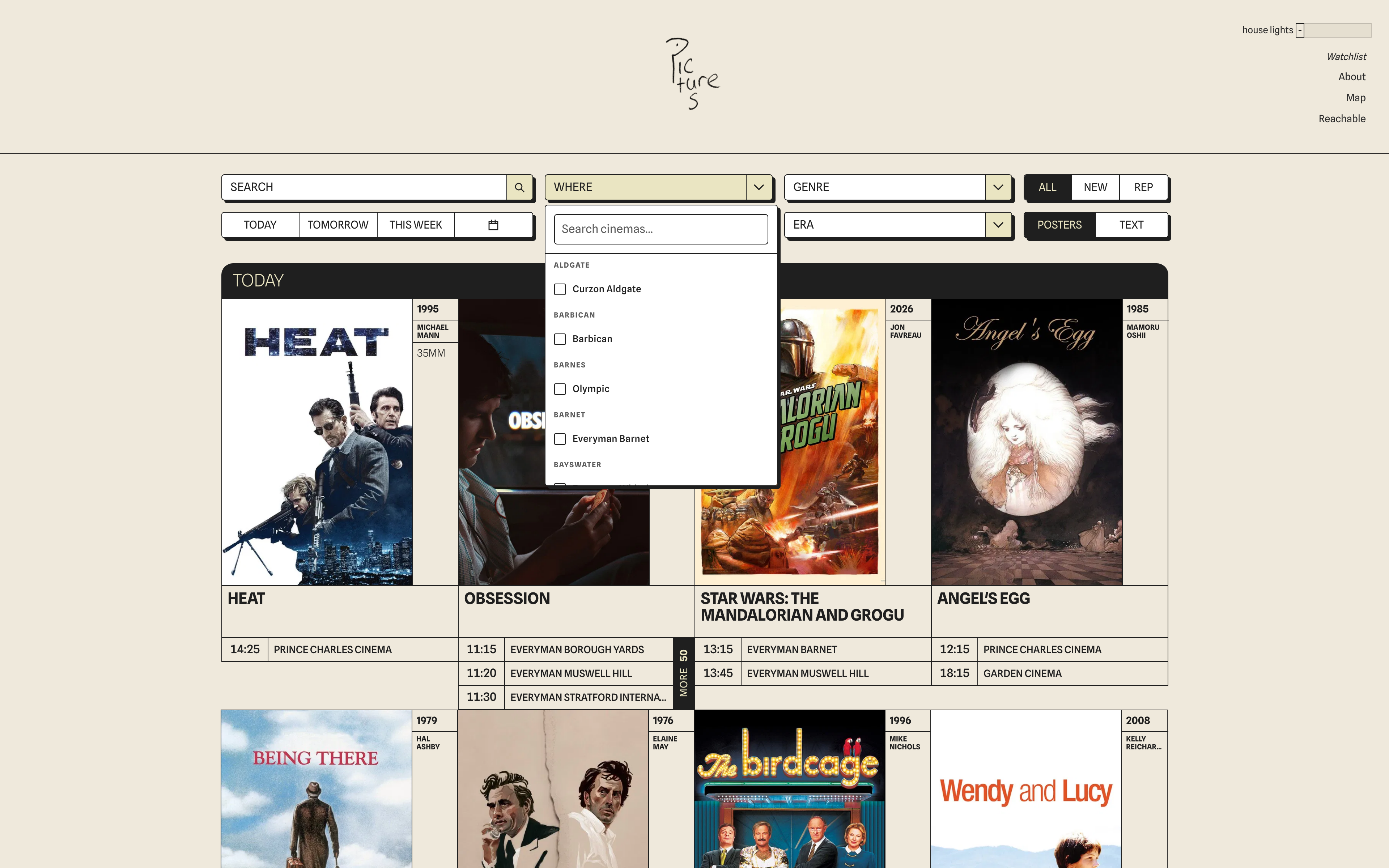
One bar of controls
Everything for narrowing down the city sits in a single quiet bar: filter by cinema, genre, format and era, then flip between a poster view and a denser text view depending on whether you are browsing or hunting. It all updates live.
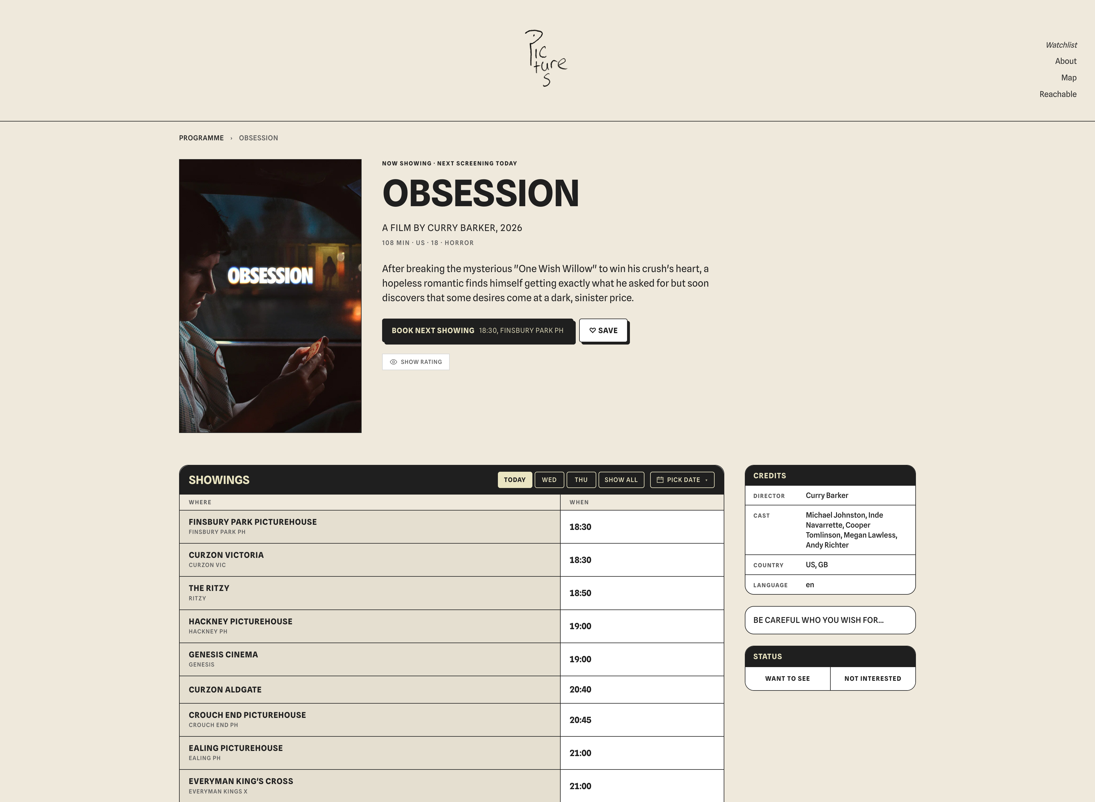
A page for every film
Each film gets its own page: the synopsis, the details, and every upcoming showing across the city with a direct link to book.
Soul, delivered
James wanted soul, and brutalism gave the guide a point of view, the kind people either love or argue about. For a tool this well used, that bit of attitude was the whole thing it was missing.