Pensions: re-designing a critical flow
Pensions: re-designing a critical flow
Improving the experience of a critical flow in the payroll process
Improving the experience of a critical flow in the payroll process

Overview
Overview
Pension submissions are complicated. They have consistently reigned as our third-most support ticketed area. Users were constantly stuck in loops: a failed submission triggering them to leave Finity to work out why before returning to fix it.
Pension submissions are complicated. They have consistently reigned as our third-most support ticketed area. Users were constantly stuck in loops: a failed submission triggering them to leave Finity to work out why before returning to fix it.
We needed to re-design the entire submissions experience to help users fix those problems immediately, rather than simply letting them know they exist.
We needed to re-design the entire submissions experience to help users fix those problems immediately, rather than simply letting them know they exist.
Team
Team
Product
Product
1
1
Engineering
Engineering
3
3
Design
Design
1
1

The problem
The problem
Pension submissions would fail, and when they did, users were on their own to figure out why.
Pension submissions would fail, and when they did, users were on their own to figure out why.
The existing interface was clunky. When submissions failed, hard-to-read errors would surface but would not link users directly to the issues. They would then have to leave Finity to check the pension providers UI to figure out (or fix) the problem there.
The existing interface was clunky. When submissions failed, hard-to-read errors would surface but would not link users directly to the issues. They would then have to leave Finity to check the pension providers UI to figure out (or fix) the problem there.
Vision
We wanted to enable our users to invite workers to onboard themselves. This means that instead of asking for information to be transcribed over the phone or via email, they could drop in and out and complete it at a time that suits them.
Research
Research
I dug into support tickets and conversations on our messaging tool (Intercom). Pensions submissions were consistently flagged as frustrating, confusing, and time-consuming, and ranked within our top 3 conversation themes each month.
I dug into support tickets and conversations on our messaging tool (Intercom). Pensions submissions were consistently flagged as frustrating, confusing, and time-consuming, and ranked within our top 3 conversation themes each month.
I spoke with 3 customers, all of which were actually getting through the flow fine. It was clear that they had learnt how to deal with the confusion because they needed to get through the flow, but the disconnect and room for improvement was clear.
I spoke with 3 customers, all of which were actually getting through the flow fine. It was clear that they had learnt how to deal with the confusion because they needed to get through the flow, but the disconnect and room for improvement was clear.

Problems & solutions 1
Problems & solutions 1
The batch problem: Our system forced everyone through a batch-oriented process, but most of our users didn't use batches. This was a holdover from how we'd originally built the feature, not how users actually worked. They had accepted it as another part of their confusing workflow.
The batch problem: Our system forced everyone through a batch review screen, even users who didn't work in batches. This was a holdover from how we'd originally built the feature, not how users actually worked.
Solution: I designed the batch screen to appear conditionally, only displaying for users who actually needed it. Everyone else went straight to reviewing their submission. We made batches what they should have been all along: an internal processing detail, not a user-facing concept. Changing this under the hood would have seriously impacted our timeline, so we hid it with some UI wizardry, fixing the problem for everyone (except our tech debt catalogue 💔).
Solution: I designed the batch screen to appear conditionally, only displaying for users who actually process multiple clients in one submission (bureaus). Everyone else goes straight to reviewing their submission. We made batches what they should have been all along: an internal processing detail, not a user-facing concept. Changing this under the hood would have seriously impacted our timeline, so we hid it with some UI wizardry, fixing the problem for everyone (except our future selves - but that’s ok for now!).
Problems & solutions 2
Problems & solutions 2
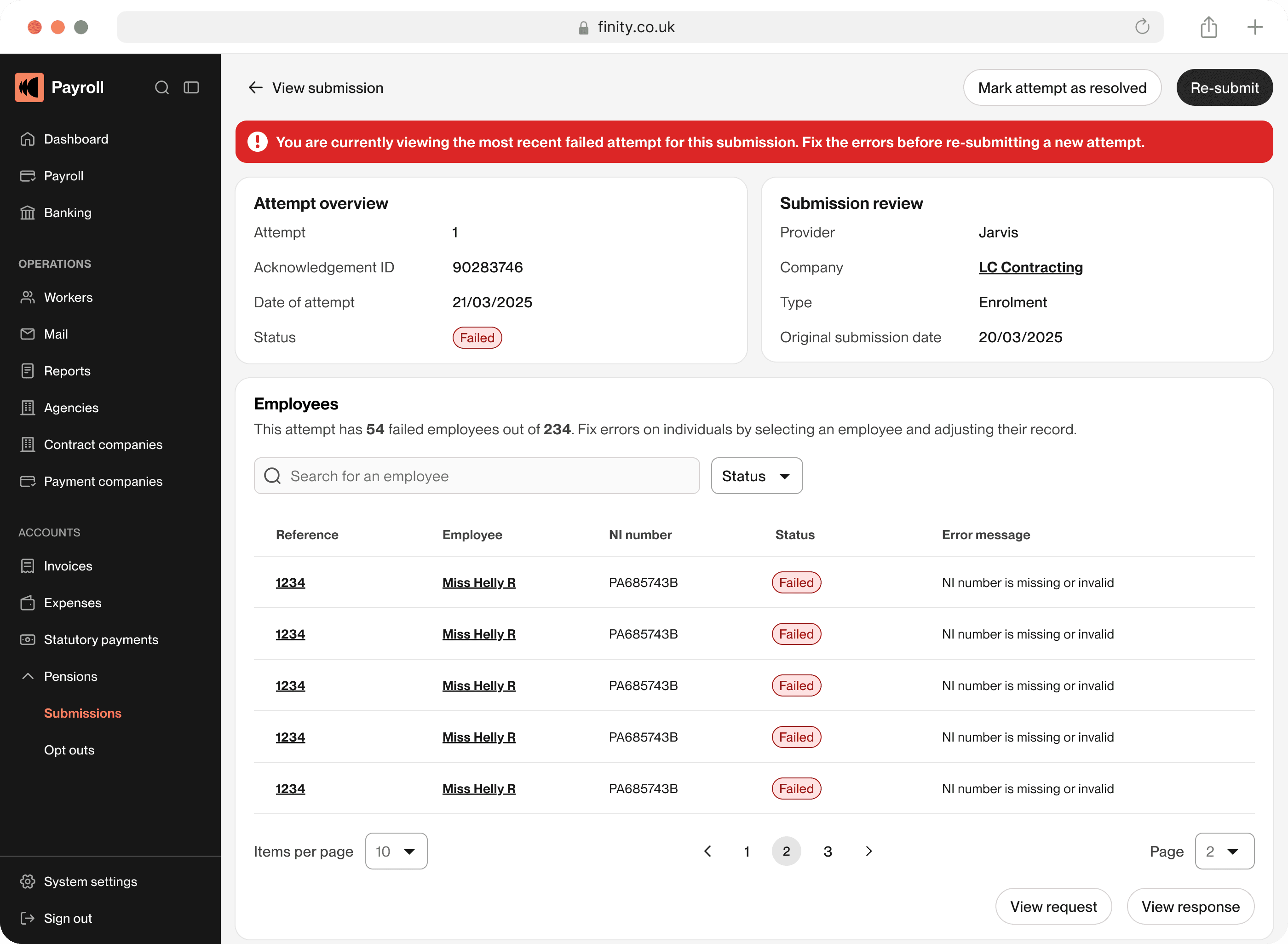
The "now go fix it yourself" problem: When submissions failed, users got a list of errors but no path to resolution.
The "now go fix it yourself" problem: When submissions failed, users got a list of errors but no path to resolution. They had to context-switch out of the system, figure out what was wrong, come back, and manually find the worker.
Solution: I designed direct links from errors to the specific workers who had issues. Now when a submission fails, users can click straight through to the worker record, fix the data in context, and resubmit, all without leaving Finity or playing detective. Where it wasn’t possible to fetch the exact worker, we filtered with what was possible to display the potential error candidates.
Solution: I designed direct links from errors to the specific workers who had issues. Now when a submission fails, users can click straight through to the worker record, fix the data in context, and resubmit, all without leaving Finity or playing detective. Where it wasn’t possible to fetch the exact worker, we filtered with what was possible to display the potential error candidates.
Problems & solutions 3
Problems & solutions 3
The invisible history problem: Users would fix errors and resubmit, but if it failed again, it wasn’t easy to know what to do. Every attempt felt like starting from scratch, sometimes they did start from scratch and this would cause issues in itself.
The invisible history problem: Users would fix errors and resubmit, but if it failed again, it wasn’t easy to know what to do. Every attempt felt like starting from scratch, sometimes they did start from scratch and this would cause issues in itself.
Solution: I designed an attempt history system. Every time a user processes a submission, we create a new attempt. They can see all previous attempts, what failed, what was fixed, and why. This gave users an audit trail and helped them understand patterns in what was going wrong. If they tried to create a duplicate submission, the system would detect this and offer a re-direct to their previous submission.
Solution: I designed an attempt history system. Every time a user processes a submission, we create a new attempt. They can see all previous attempts, what failed, what was fixed, and why. This gave users an audit trail and helped them understand patterns in what was going wrong. If they tried to create a duplicate submission, the system would detect this and offer a re-direct to their previous submission.


Results
Results

Reduced support tickets: Pensions submissions dropped in our support queue. Users could actually fix their own errors instead of calling for help. Pensions were no longer in the top 3.
Reduced support tickets: Pensions submissions dropped in our support queue. Users could actually fix their own errors instead of calling for help. Pensions were no longer in the top 3.
Fewer failed attempts per submission: Before the re-design users would often submit, fail, fix randomly, resubmit, fail again. The direct linking and attempt history helped them fix the right things the first time, reducing the number of attempts needed per submission.
Fewer failed attempts per submission: Before the re-design users would often submit, fail, fix randomly, resubmit, fail again. The direct linking and attempt history helped them fix the right things the first time, reducing the number of attempts needed per submission.

Impact
Impact
By making submissions actually navigable, we freed up our support team to handle truly complex issues instead of walking users through the same confusing flow repeatedly. Users could process more submissions in less time, with fewer errors, which meant less frustration for them and their clients.
By making submissions actually navigable, we freed up our support team to handle truly complex issues instead of walking users through the same confusing flow repeatedly. Users could process more submissions in less time, with fewer errors, which meant less frustration for them and their clients.
More importantly, we turned pensions submissions from a dreaded task into something users could actually understand, control, reduce error potential and fix them when they happened.