Empowering the care team through the carer’s app.
A core feature set on the member side: actions, calls and key documents.
Overview
KareHero connects family carers with a real human, a care expert who helps them navigate one of the hardest stretches of their life. Funding crises, hospital discharges, a dementia diagnosis landing out of nowhere. The product's job is to make those human interactions count.
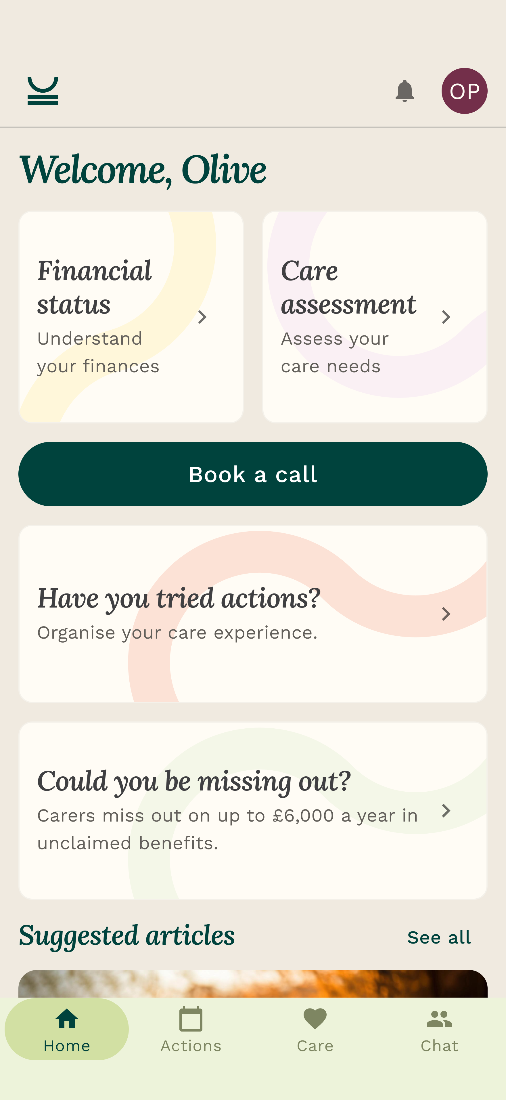
The screens here are a core feature set I designed inside the existing member app, the carer's side of that relationship. Actions, Calls and Key Documents, woven into the place a carer like Olivia already lives. The CAM team have the other half, an internal console they run their day from. This case study stays on the member side, because that is what these screens are, and because this feature set is the surface that feeds the console.
It started from one goal: more meaningful interactions. The CAM team are the business's bread and butter, so the brief was to empower them through the product, not leave them working around it. Every action a carer completes, every document they upload, every call they have lands here first, and flows straight into the console. The carer gets a calmer app. The care team gets live visibility into it, with no impersonation and no spreadsheet.
The problem
Meaningful interactions was the theme of the quarter. The headline goal was engagement, getting carers into the product more often, and making the time care experts spend with them actually count. The instinct with a target like that is to go straight for the number. But the interactions weren't being lost because carers didn't need help. They were being lost because three structural problems were actively blocking them.
The first was the tooling gap. Our care experts are the heart of the product, the people in touch with customers the most, and the ones with the most empathy for them. And we'd given them tools so insufficient they were hacking around us with spreadsheets. Building a shortlist for a single customer took 2.5 hours, partly because the care expert had to impersonate the user to read their form answers, then context-switch across five-plus tools to pull it together.
The second was repetition. Every form asked who you were caring for. The same information got requested across multiple touchpoints. When you do that to people, you don't just waste their time, you teach them that engaging with the product is tedious, and they disengage.
The third was a generic experience that treated every carer the same, no matter how different their situation. But that's a separate strand of work. This case study is about the first two: building the member side into a real, structured surface, so the care team can finally work off it instead of around it, and killing a big chunk of the repetition in the process.
Team
- Product1
- Engineering3
- Design1
The vision
Make this feature set the home for the follow-up work, right inside the carer's existing app. A carer opens it and sees their documents, their calls and the follow-ups they owe, as a clear, tappable list. The follow-ups a care expert creates don't vanish into an email the carer never opens. They land here as “From your care expert”, so the conversation that happened on the phone actually carries on afterwards.
And because all of that lives on the member side, it becomes the care team's source of truth too. Their internal console reads the same actions, calls and documents the carer sees. No impersonation. No spreadsheet. No hunting across tabs. One surface, looked at from two sides.
Research and insights
This work sat on top of a care expert research synthesis. I spoke to the care experts directly. They're internal, which meant I had the rare luxury of actually talking to my users rather than building empathy profiles second-hand.
I documented the thinking in a set of Linear PRDs so the team could follow the logic from “why this matters” all the way down to interaction detail:
Post-call actions were getting asked for in conversation and then lost, to Slack, to email, to memory. There was no system. Baseline tracking of follow-ups was roughly 0%.
Shortlists alone took 2.5 hours per customer, and a chunk of that was impersonating the user just to read their data.
Carers saw nothing after a call unless they happened to check their email. The thread of the relationship just dropped.
The same information was being collected over and over, which ate care expert time on the back end too, validating data and correcting users’ missteps.
Four things that look like one thing, but aren’t
Calls, call notes, actions and documents kept getting talked about as if they were the same kind of object. They're not, and conflating them would have baked confusion into the data model and the navigation.
So before any screens, I wrote the information architecture down. Four independent entities, connected by reference where it makes sense. A call is a scheduled event with a lifecycle, it is not an action and doesn't belong in a todo list. Call notes always attach to a call. Actions can come from a call, a care expert or a carer, but don't need a call to exist. Documents live on their own. Getting that right up front let three features ship as one coherent system instead of three overlapping ones.
The upload trap
There are two completely different kinds of file in this system. The ephemeral attachment, a photo of a prescription a carer snaps onto their own action, which should die with that action. And the permanent Key Document, the funding guide or power-of-attorney form the family needs to keep forever. The risk was a carer uploading an important document onto a throwaway action, then losing it when the action got cleared.
The solution was to make it impossible by design, not by warning. If a care expert needs a document, they set the action's “Link to” destination to Key Documents. The carer's button becomes “Upload document”, the file lands permanently in Key Documents and auto-links back to the action. Don't write a help doc telling people not to make a mistake, remove the path to the mistake.
Execution: Actions on the member side
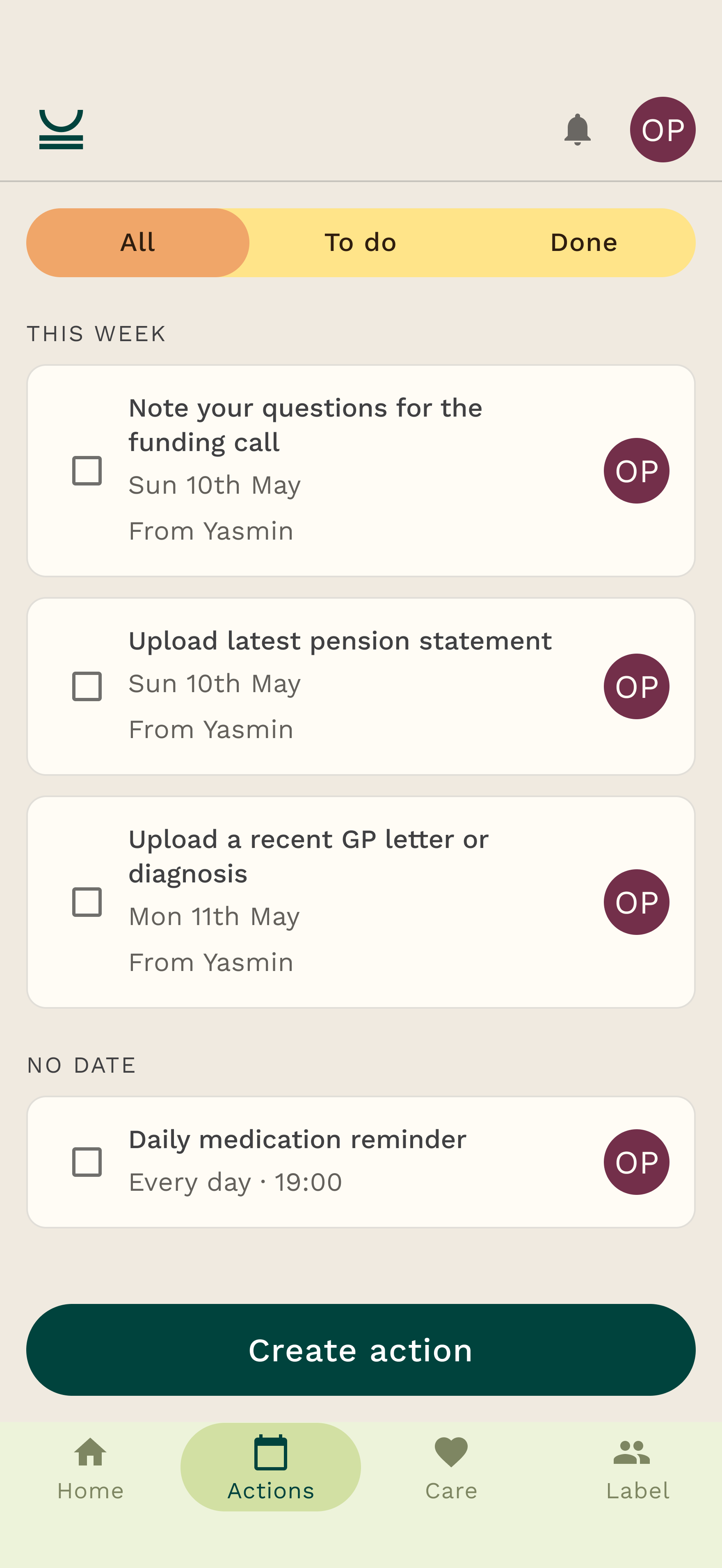
Everything lives in cards in the carer's app, in the same visual language as the rest of the page. Actions get their own tab, with This Week and No date groupings and an All / To do / Done filter across the top. Each card shows who it's for and who it came from, so “From Yasmin” reads at a glance as a follow-up from their care expert.
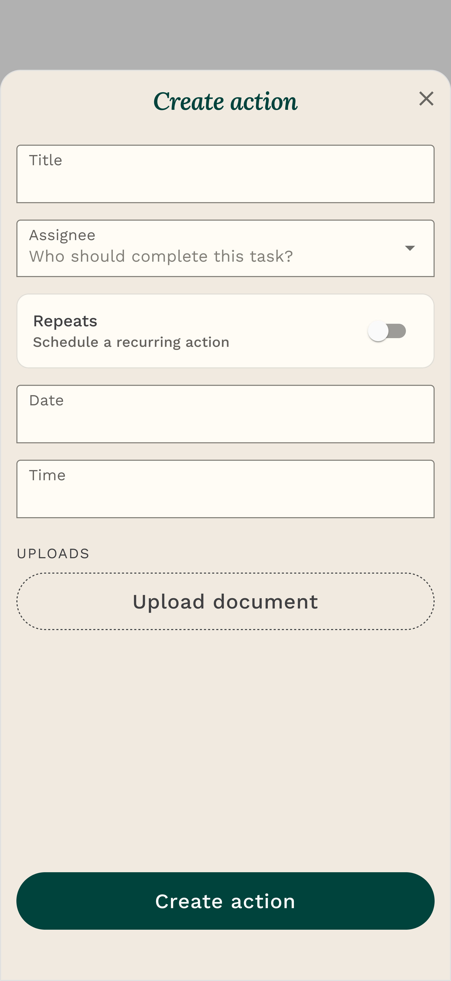
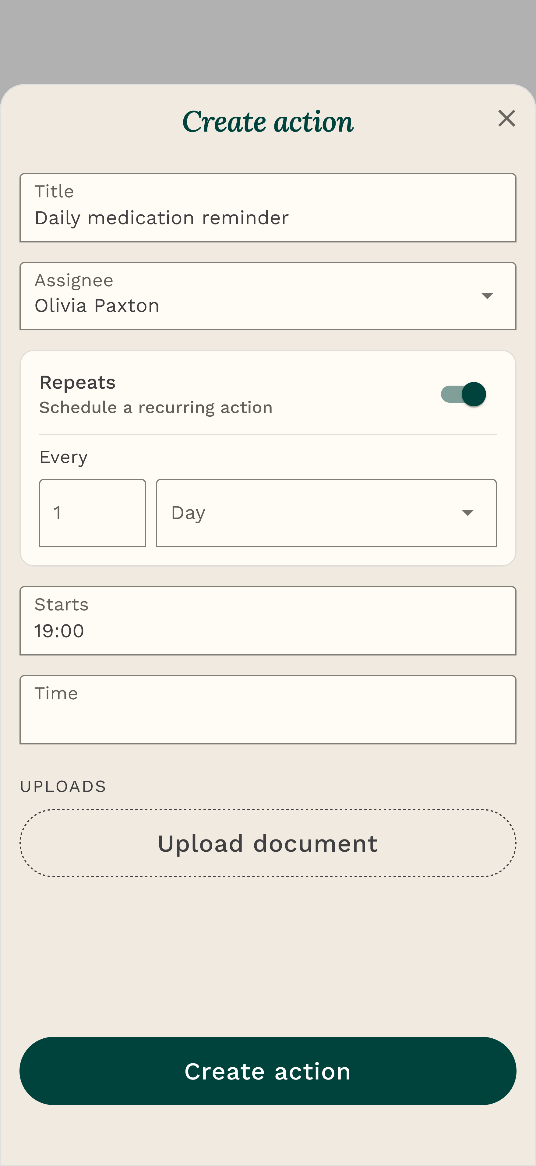
Actions is a proper task tool, not a static list. Create, edit, assign, complete. Optional due dates. A recurring toggle that auto-generates the whole series. A “view before you edit” read mode so nobody fat-fingers a care plan. The container defaults to the week ahead, overdue first, then soonest due, then undated. Completed actions hide by default, and the moment a carer ticks one off, their care expert is notified in the console. The carer's tap is the care team's signal.
Execution: calls and documents
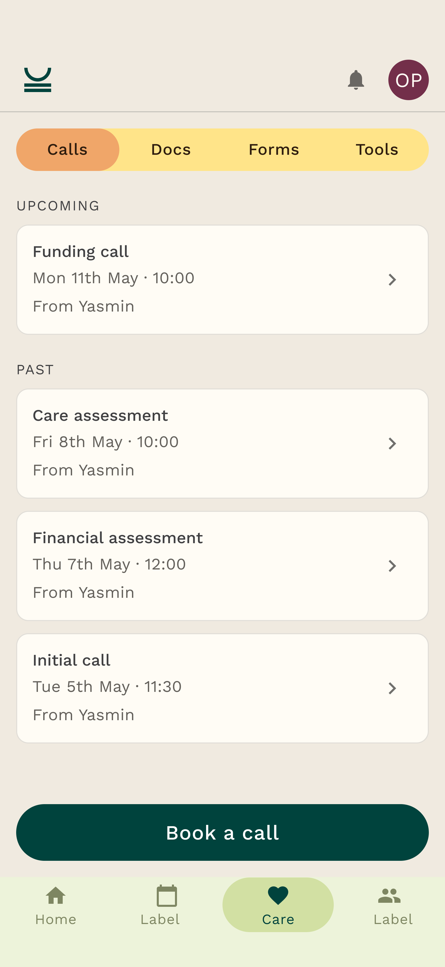
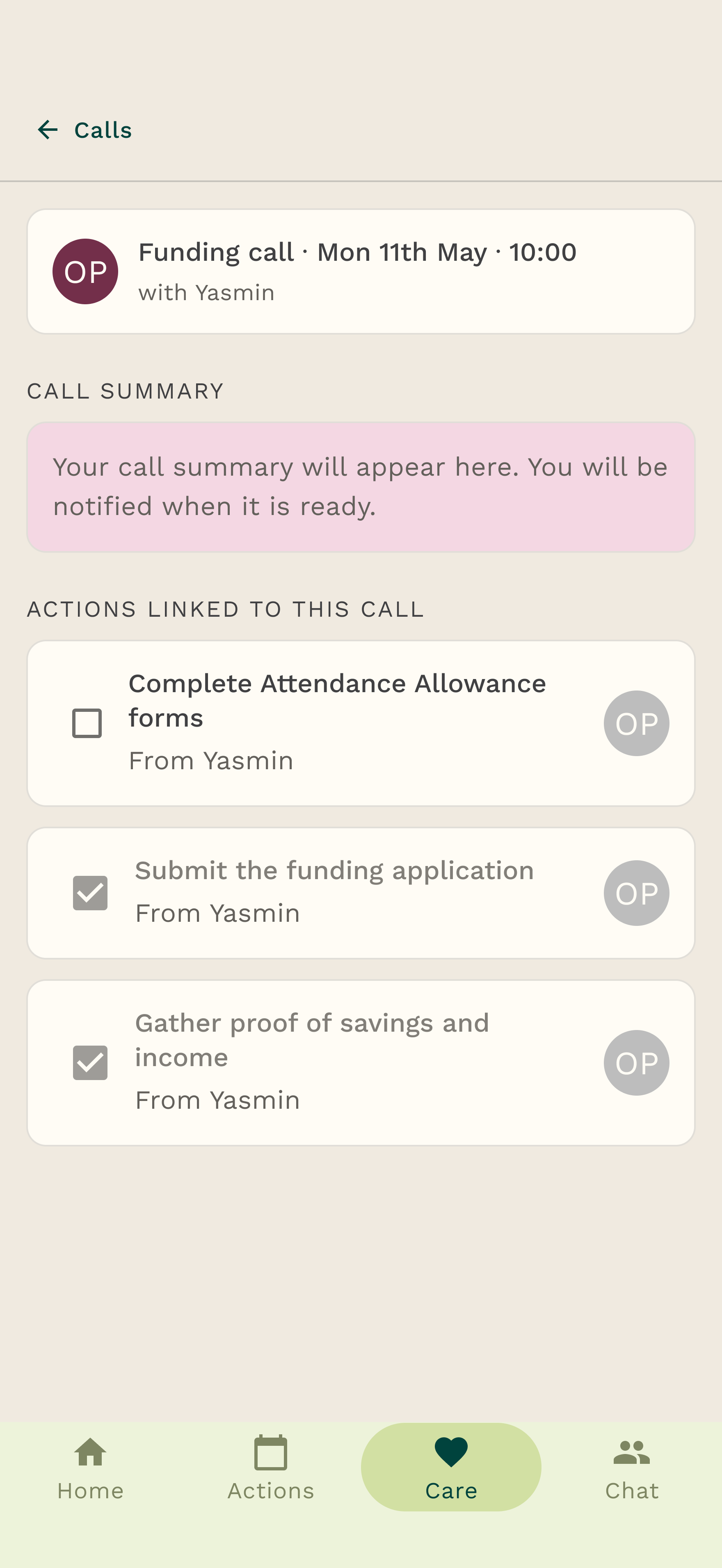
Calls live in the carer's Care hub. Upcoming calls to book or reschedule, and past calls with their summary and the actions linked to each one. The carer doesn't write the summary, their care expert does it from the console after the conversation, and it surfaces here against the right call (“Your call summary will appear here, you will be notified when it is ready”). The phone call stops being a thing that happens and then evaporates. It becomes a record the carer can return to.
Key Documents is a simple, deliberate upload. Name, optional tags, an optional note. Visible to the whole care circle, which means the moment a carer adds one, their care expert has it too, no chasing over email. No versioning, no in-app editing. That restraint is the point for V0.
How the member side powers the care team
This is the part that matters most, and the reason the case study sits on the member side. Every one of these screens is also an input to the internal console the care team runs their day from. The two halves share one data model, so the member app isn't a read-only mirror of the console, it's the place a lot of the truth is actually created.
A care expert assigns a follow-up from the console and it lands in the carer's Actions tab as “From your care expert”, with a tappable link back to the call it came from. The carer completes it, and the console updates, no impersonation needed to check. The carer uploads a funding document, and it's in the care circle for the team instantly. The relationship that used to live in one person's inbox now lives in a shared system, and the carer never sees the machinery, just five tabs that quietly got richer.
That's the design bet. Don't build the care team a console fed by yet another round of data entry. Make the carer's own app the source, and let the console read from it. Good for the carer, good for the team, one system instead of two drifting copies.
Defining success
This is in-flight work and being built. This is what we defined success as, and why these are the right things to watch.
Zero impersonation for actions. The care team reads every follow-up and its status straight from the member-side data, with no need to log in as the user.
100% follow-up capture. Every post-call action item lands as a tracked action in the carer’s app. Baseline today is roughly 0%, it is all informal.
Adoption as the real test. All five care experts using Actions as their primary follow-up method within two weeks.
Impact
The point was never the features. It was the theme underneath them: meaningful interactions. The CAM team are the business's bread and butter, the relationships they hold are the product, so the goal was to empower them through the product rather than leave them working around it. You don't move a number like engagement by chasing it directly. You move it by removing the structural things blocking the people who drive it.
Give the care team a real surface to work from, the carer's own app, and you hand back the capacity they were losing to spreadsheets and impersonation, capacity they can spend on the carers who need them. Pull follow-ups into that app and the relationship survives the end of the phone call. Get the information architecture right once and the features behave like one calm system instead of three noisy ones.
That's the work I'm proudest of here: not the individual screens, but the decision to make the carer's app the source the CAM team are empowered by, and to map how calls, actions and documents actually relate before drawing a single one. The unglamorous bit is the bit that made the rest hold together.