Designing clarity into chaos.
Reducing pension uncertainty in a complicated flow.

Overview
Pensions are complicated. They have been consistently our third-most ticketed area for support, right behind payroll. Users were constantly stuck in loops: a submission would fail, the system would tell them something was wrong, they'd have to leave Finity to figure out what, then come back and hunt down the problematic worker to fix it.
We needed to redesign the entire submissions experience to actually help users fix problems, not just tell them problems existed.
Team
- Product1
- Engineering2
- QA2
- Design1
The problem
Pension submissions would fail, and when they did, users were on their own to figure out why.
The existing interface was clunky, forcing everyone through a “batch” flow whether they worked in batches or not (most didn't). When submissions failed, the system would surface hard-to-understand errors and not link users directly to the workers who had the issues. Often, users would leave Finity to check the pension providers UI to try and figure out (or fix) the problem there.
So users would have to:
Find the error (not as easy as it sounds)
Read the error, which may or may not make sense
Leave Finity to check the pension provider’s system
Figure out which worker it was about
Come back to Finity
Search for that worker
Fix the data
Re-submit and hope it worked this time
This happened constantly, and pensions are confusing enough without the interface making it worse.
Research
I dug into support tickets and conversations on our messaging tool (Intercom). Pensions submissions were consistently flagged as frustrating, confusing, and time-consuming, and ranked within our top 3 conversation themes each month.
I spoke with 3 customers, all of which were actually getting through the flow fine. How? They'd given up on understanding it. They just accepted batches as “part of how pensions works” even though it made no sense for their workflow, they also didn't cite switching between software as an issue. But to me, the disconnect and room for improvement to be made was clear.
The key insights I found
Users didn’t understand batches: and for most users, batches didn’t matter. Only bureaus (who manage multiple clients) needed them.
The system told users there were errors but didn’t help them fix them: there were no direct links to problematic workers, and no clear guidance on what to do next.
Users were leaving Finity constantly: checking pension provider systems, cross-referencing data, then coming back to manually hunt down records. And sometimes, they would fix the errors within the pension providers software, meaning the data was now mis-matched between our systems (as problematic as it sounds!).
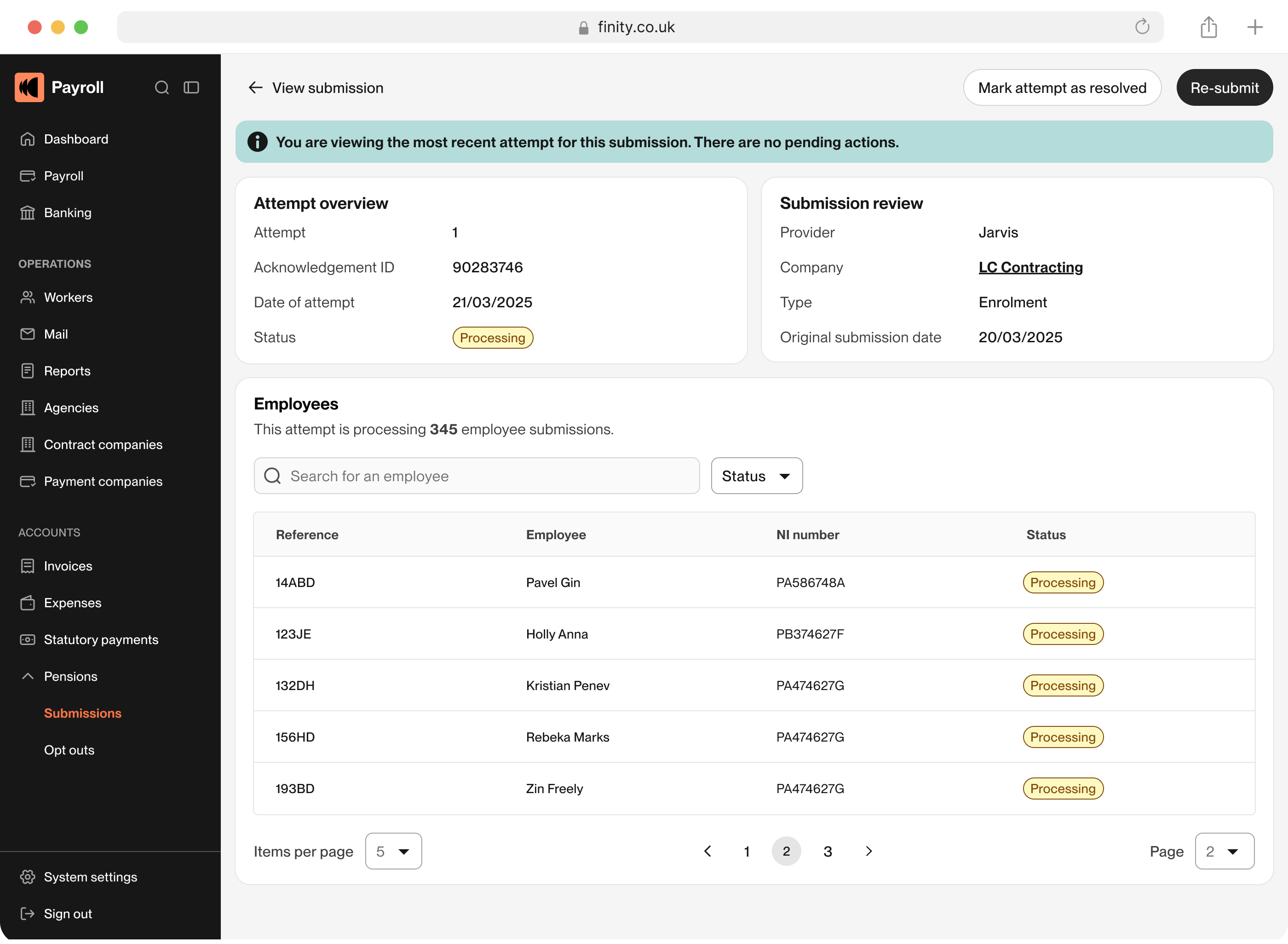
Attempts weren’t intuitive: when users resubmitted after fixing errors, their history was hidden behind unfriendly language (’transactions’) that didn’t explain or display what they really needed to know.
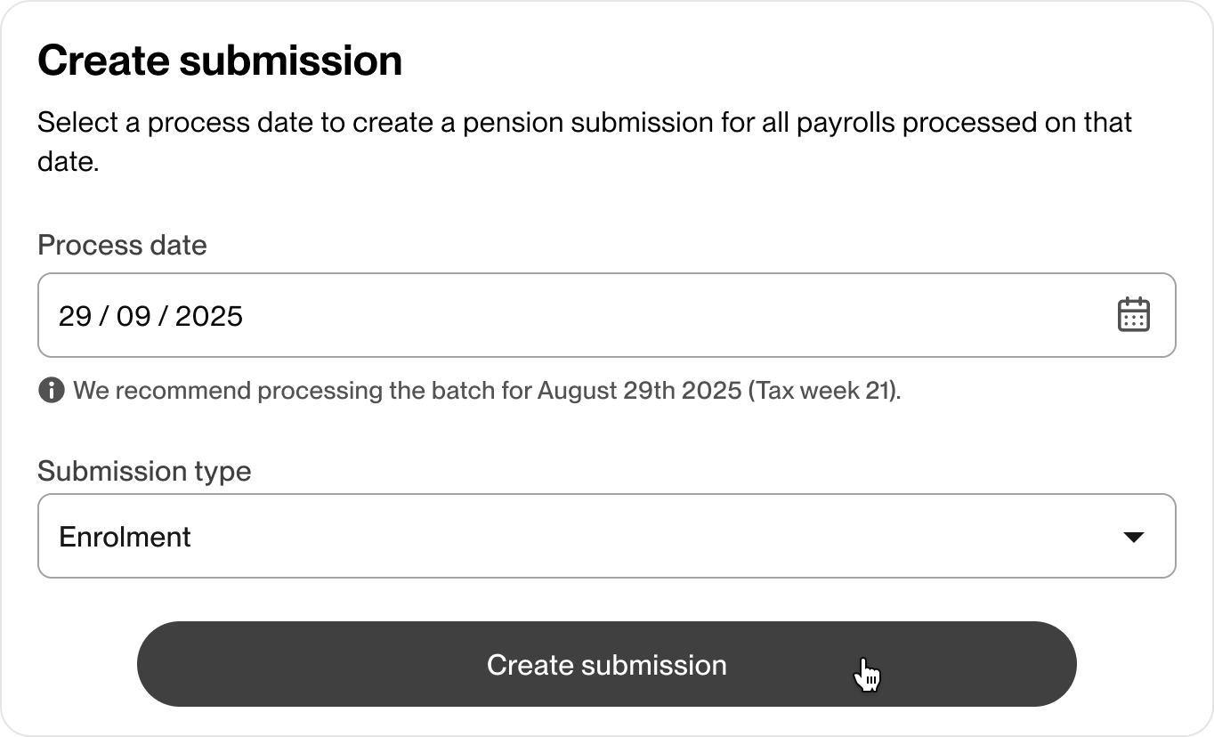
The batch problem
Our system forced everyone through a batch review screen, even users who didn't work in batches. This was a holdover from how we'd originally built the feature, not how users actually worked.
Solution. I designed the batch screen to appear conditionally, only displaying for users who actually process multiple clients in one submission (bureaus). Everyone else goes straight to reviewing their submission. We made batches what they should have been all along: an internal processing detail, not a user-facing concept. Changing this under the hood would have seriously impacted our timeline, so we hid it with some UI wizardry, fixing the problem for everyone (except our future selves, but that's ok for now!).
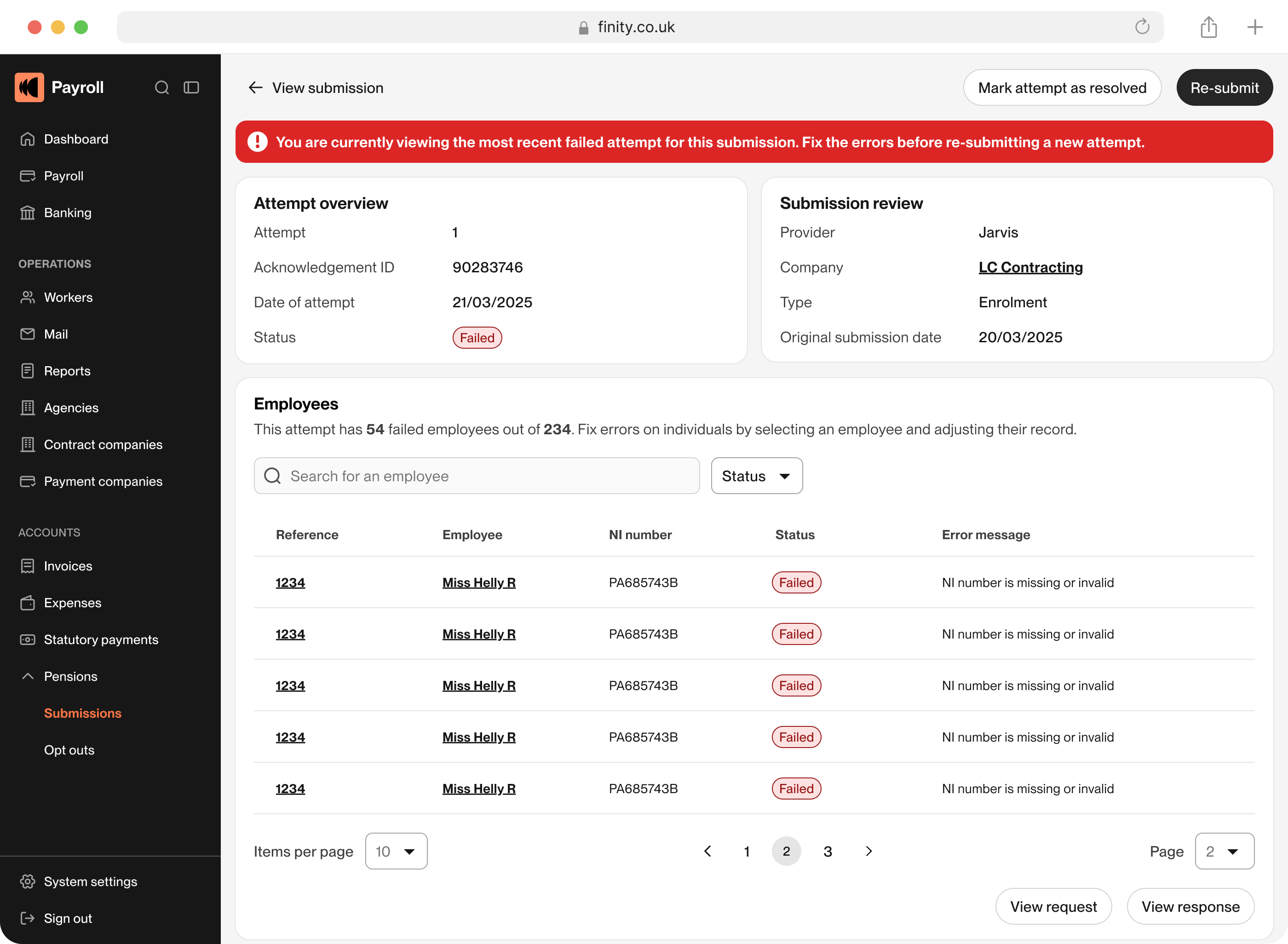
The “now go fix it yourself” problem
When submissions failed, users got a list of errors but no path to resolution. They had to context-switch out of the system, figure out what was wrong, come back, and manually find the worker.
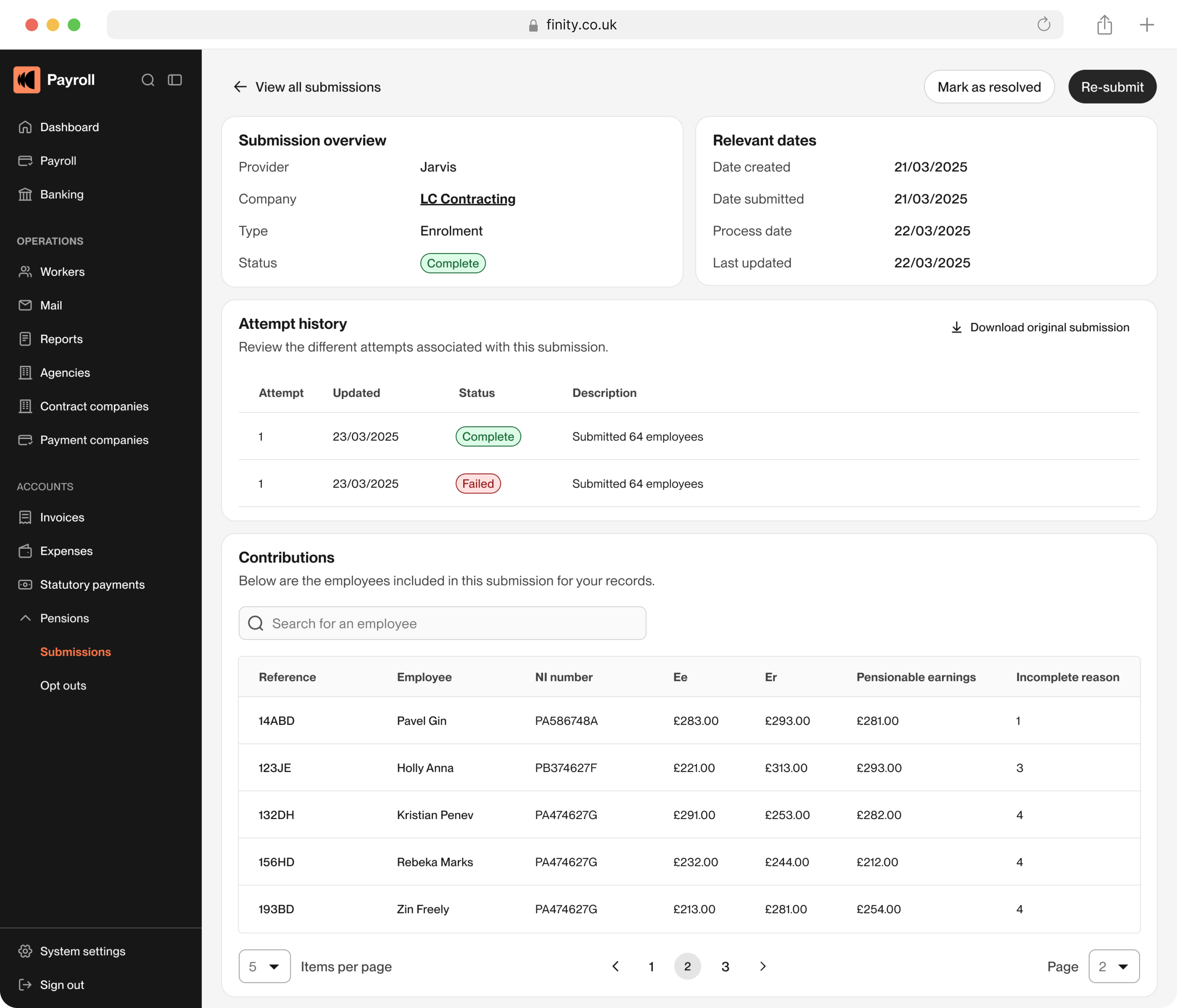
Solution. I designed direct links from errors to the specific workers who had issues. Now when a submission fails, users can click straight through to the worker record, fix the data in context, and resubmit, all without leaving Finity or playing detective. Where it wasn't possible to fetch the exact worker, we filtered with what was possible to display the potential error candidates.
The invisible history problem
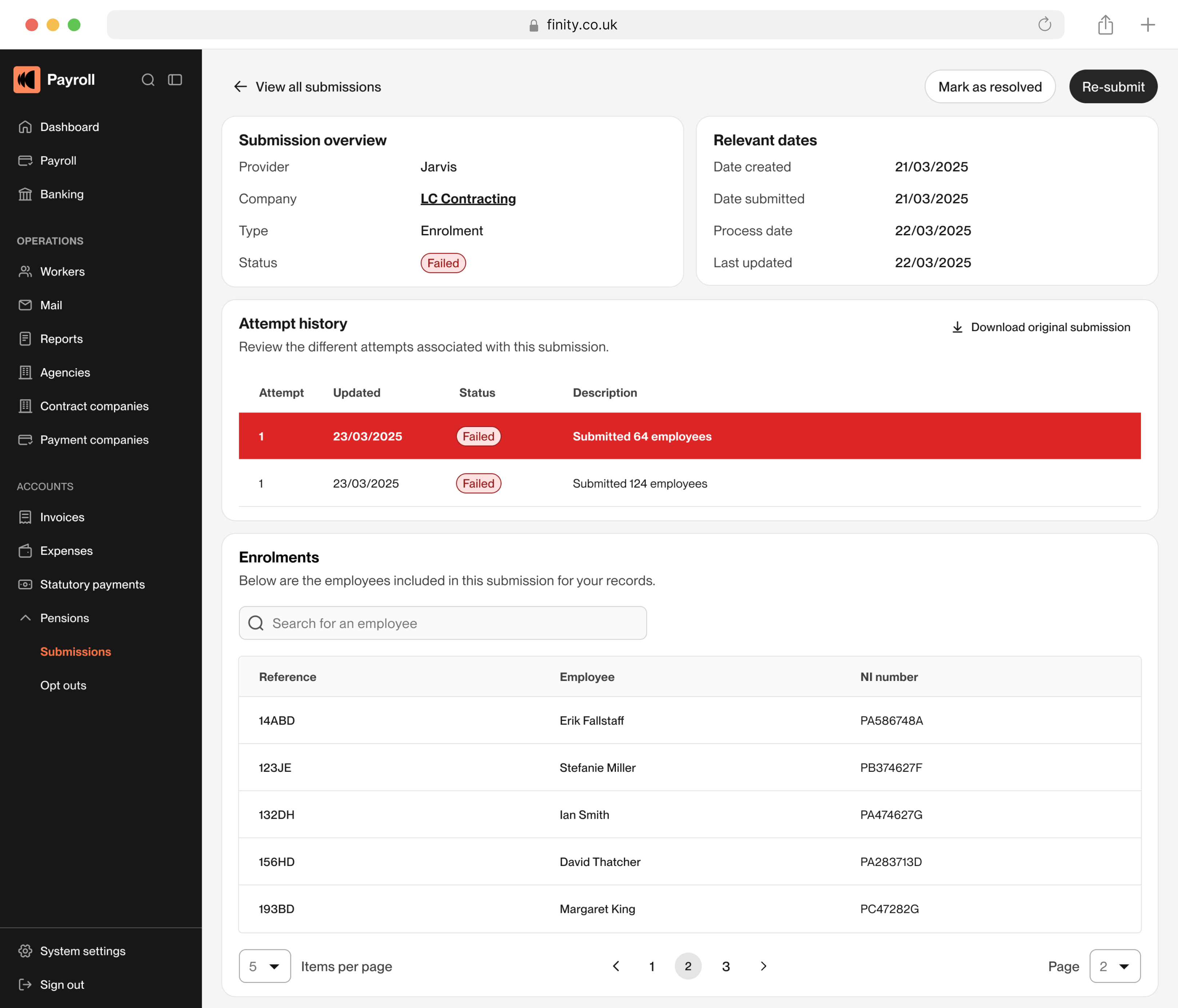
Users would fix errors and resubmit, but if it failed again, it wasn't easy to know what to do. Every attempt felt like starting from scratch, sometimes they did start from scratch and this would cause issues in itself.
Solution. I designed an attempt history system. Every time a user processes a submission, we create a new attempt. They can see all previous attempts, what failed, what was fixed, and why. This gave users an audit trail and helped them understand patterns in what was going wrong. If they tried to create a duplicate submission, the system would detect this and offer a re-direct to their previous submission.
Execution
I redesigned the entire submissions flow to match how users actually work, not how our system happened to be built. Key design decisions:
Conditional interface: batch screens only appear when needed. Most users never see them.
Direct linking: errors link straight to the problematic worker records. No more hunting.
Attempt history: every resubmission is tracked. Users can see what they’ve tried and compare attempts.
Mark as resolved: sometimes users fix things in the pension provider’s UI and that data doesn’t sync back. We let them manually mark submissions as resolved so they’re not stuck in a failed state forever.
Clear status indicators: Incomplete, Failed, Processing, Queued, Complete, Resolved. Users always know where things stand.
Testing results
Reduced support tickets: pensions submissions dropped in our support queue. Users could actually fix their own errors instead of calling for help. Pensions were no longer in the top 3.
Fewer failed attempts per submission: before the redesign, users would often submit, fail, fix randomly, resubmit, fail again. The direct linking and attempt history helped them fix the right things the first time, reducing the number of attempts needed per submission.
Business impact
By making submissions actually navigable, we freed up our support team to handle truly complex issues instead of walking users through the same confusing flow repeatedly. Users could process more submissions in less time, with fewer errors, which meant less frustration for them and their clients.
More importantly, we turned pensions submissions from a dreaded task into something users could actually understand, control, reduce error potential and fix them when they happened.